4. Visual Design Principles
Purpose of These Notes
These notes explain:
- how to use colour, typography, and layout to guide user attention
- core design principles (contrast, balance, hierarchy, repetition)
- why visual decisions should serve user needs, not just aesthetics
- how to make visually effective designs that work for everyone
Key Concepts
By the end of this topic, you must understand:
- Visual hierarchy: Using size, colour, and contrast to establish importance
- Contrast: Making important elements stand out
- Consistency: Using the same styles throughout for predictability
- White space: Using empty space to reduce cognitive load and improve readability
- Colour psychology: How colour choices influence user perception and emotion
Visual design should clarify, not decorate. Every choice should serve the user.
Core Explanation
Visual Hierarchy
Visual hierarchy is the arrangement of elements to guide user attention: most important → least important.
Users don't read linearly. They scan, looking for landmarks. Your job is to make important things obvious.
Tools for Creating Hierarchy
Size:
Large elements attract attention first
Medium elements are secondary
Small elements are tertiary
Colour:
- Bright, saturated colours stand out
- Muted colours recede
- High contrast = high importance
Contrast:
- Differences in colour, size, shape, or whitespace attract attention
- Low contrast suggests less importance
Position:
- Top-left (in left-to-right languages): strong starting point
- Center: draws attention
- Edges: less noticed
Learn More: Visual Hierarchy in UX/UI Design
This video explores core principles like size, color, and typography with real website examples to show how to guide user attention effectively.
Visual Hierarchy in UX/UI Design | Make Your Designs Instantly Stand Out
Example: E-commerce Product Page
┌────────────────────────────┐
│ Large product image        │  ← Primary focus (size + position)
│                            │
├────────────────────────────┤
│ Product name (large, bold) │  ← Second focus (size + contrast)
│ ⭐⭐⭐⭐⭐ 342 reviews     │  ← Social proof (smaller, secondary)
│ $49.99 (bright green)      │  ← Price, high contrast (important)
│ [BRIGHT GREEN BUY BUTTON]  │  ← Call to action (size, colour, position)
│ + Add to wishlist (grey)   │  ← Secondary action (low contrast)
└────────────────────────────┘
Every visual choice guides the eye. Notice:
- Large image = primary focus
- Big, bold product name = second focus
- Small reviews = contextual
- Green button = action
- Grey wishlist = secondary

Contrast
Contrast is the difference between elements. High contrast makes things stand out; low contrast makes things blend.
Colour Contrast
- Text must have sufficient contrast with its background for readability
- WCAG AA standard: 4.5:1 contrast ratio for normal text
- WCAG AAA standard: 7:1 contrast ratio
Test your colours:
- WebAIM Contrast Checker (https://webaim.org/resources/contrastchecker/)
- Sketch or Figma built-in contrast checkers
Type Contrast
- Bold text contrasts with regular text
- Large text contrasts with small text
- Serif fonts contrast with sans-serif fonts
Spatial Contrast
- Elements grouped together are related
- Elements far apart are different
- Gaps and white space create emphasis

White Space
White space (negative space) is empty space around elements.
Poor use: Everything is crammed together. Cognitive overload.
Good use: Elements breathe. Easier to scan and read.
BAD:                              GOOD:

Header                            Header
Subtitle
Link 1
Link 2                            Subtitle
Product 1 - $50
Product 2 - $60                   [Space]
Product 3 - $55                   Link 1
Description 1                     Link 2
Description 2
...                               [Space]

                                  Product 1 - $50
(Crowded, hard to read)          Product 2 - $60
                                  Product 3 - $55

                                  [Space]

                                  Description 1
                                  Description 2
                                  ...

                                  (Clear, scannable)
Rules:
- Margin: Space between element and edge
- Padding: Space inside an element
- Line spacing: Space between lines of text (usually 1.5× text size minimum)

Typography
Typography is the art of arranging text. It includes:
- Typeface choice: Serif vs. sans-serif, quirky vs. professional
- Font size: Hierarchy (headings > body > labels)
- Font weight: Regular, bold, light (creates contrast)
- Line length: 50–75 characters per line for readability
- Line height: Space between lines (1.5× text size minimum)
Serif vs. Sans-Serif
Serif fonts (e.g., Georgia, Times):
- Traditional, formal
- Small lines/feet on letters
- Good for print and body text
- More formal tone
Sans-serif fonts (e.g., Arial, Helvetica):
- Modern, clean
- No small lines
- Better on screens at small sizes
- More approachable tone
Rule: Don't mix too many fonts. Typically 1–2 font families per site.

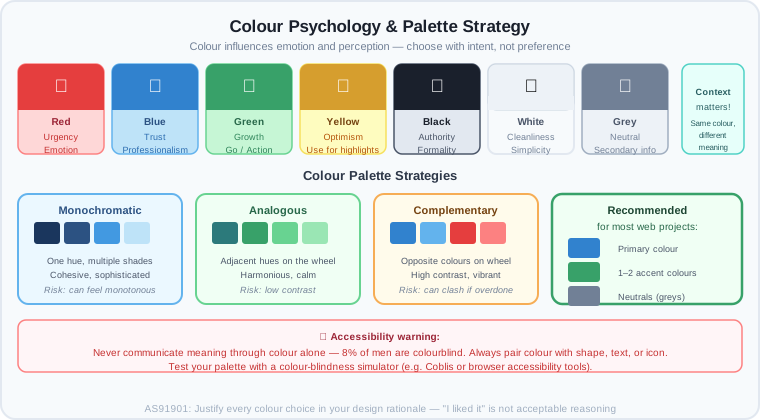
Colour Psychology
Colour influences emotion and perception:
- Red: Urgency, importance, emotion (use sparingly)
- Blue: Trust, calmness, professionalism (corporate favourite)
- Green: Growth, health, nature (often used for positive actions)
- Yellow: Optimism, happiness (hard to read as text; use for highlights)
- Black: Authority, formality, power
- White: Cleanliness, simplicity, emptiness (context-dependent)
- Grey: Neutrality, calm, secondary information
Context matters: The same colour can convey different meanings based on context and culture.
Colour Palette Strategy
Monochromatic: One colour in varying shades (cohesive, sophisticated, risky if dull) Analogous: Colours next to each other on the wheel (harmonious, less contrast) Complementary: Opposite colours on the wheel (high contrast, vibrant, can clash) Triadic: Three colours equally spaced on the wheel (balanced, complex)
For most web projects: Pick a primary colour + 1–2 accent colours + neutrals (greys, blacks).
Learn More: Color Theory & Typography for Beginners
A comprehensive breakdown of how to select color schemes and typography to create professional designs from scratch.
Graphic Design for Beginners | Typography, Color Theory, & More
Design Principles: The Gestalt Principles
The Gestalt Principles are rules of human perception about how we group and organize visual information:
Proximity
Elements close together are perceived as related.
Related items:          Separate items:
A B C                   A    B    C
D E F                   D    E    F
(Grouped in rows)       (All separate)
Similarity
Elements with similar appearance are perceived as related.
Similar colour:         Similar shape:
🔴 🔴 🔵               ■ ■ ●
🔴 🔴 🔵               ■ ■ ●
Continuance
The eye follows lines and curves.
↗→→→→→               Buttons in a row
                    (eye naturally follows)
Closure
Our brain completes incomplete shapes.
🟠🟠🟠             (Brain sees a circle,
  🟠              even though it's broken)
Learn More: Gestalt Principles Explained
Explore how our brains naturally group visuals and how these psychological principles are applied to modern web and UI design.
The Gestalt Principles | Basics for Beginners

Worked Example: Conceptual Reasoning
Scenario: Redesigning a health clinic's website.
Goal: Help users book appointments.
Initial design:
- Small green "Book Appointment" button in the footer
- Unclear because small + low positioning
- Users miss it or get confused about next steps
Visual hierarchy problem: Call-to-action is buried.
Redesign based on hierarchy:
- Large "Book Your Appointment" heading (blue, professional)
- Three cards showing clinic locations (proximity: grouped together)
- For each location: Address, Hours, [BRIGHT GREEN BOOK BUTTON]
- Buttons are:
- Larger (size = importance)
- Bright green (colour = action)
- High contrast with background (contrast = clarity)
- Plenty of white space around (white space = focus)
Visual principles applied:
- Hierarchy: Heading → Locations → Buttons (largest to smallest importance)
- Contrast: Green button stands out against neutral background
- Proximity: Address, hours, and button grouped per location (related information together)
- White space: Breathing room between cards makes each location scannable
- Colour psychology: Green signals "go/action"; blue signals "trust" (healthcare)
Result: Users immediately see they can book. Booking conversion increases.
Common Misconceptions
Misconception 1: "Beautiful design = good design"
Why it's wrong: A gorgeous purple with pink text looks cool but is unreadable. Beautiful ≠ usable.
Correct thinking: Design serves function. It should be beautiful AND usable.
Misconception 2: "More colour = more interesting"
Why it's wrong: Too many colours create visual chaos. The eye doesn't know where to look.
Correct thinking: Limit your palette. Use a primary colour, 1–2 accents, and neutrals.
Misconception 3: "Users read websites top-to-bottom, left-to-right"
Why it's wrong: Users scan quickly, looking for landmarks. They jump around.
Correct thinking: Use hierarchy to guide scanning. Make important things obvious.
Misconception 4: "All users see colour the same way"
Why it's wrong: 8% of men and 0.5% of women are colourblind. More experience low vision or astigmatism.
Correct thinking: Don't rely on colour alone. Pair colour with shape, size, or text.

Assessment Relevance
In AS91901, you must submit:
- High-fidelity prototype demonstrating visual design choices
- Design rationale document explaining colour, typography, and hierarchy choices
- Accessibility verification: Colour contrast checked, text readable, hierarchy clear
In your design critique, your teacher will ask:
- "Why did you choose this colour scheme?"
- "How does your hierarchy guide the user's eye?"
- "Why is this button larger than this link?"
- "Does your design work for colourblind users?"
Visual design is not decoration. It's function.
External Resources
Design Principles
- Laws of UX (jonnyablonski.com) – Interactive guide to design principles
- Gestalt Principles in Web Design – Detailed explanation of visual grouping
Colour
- Colour Psychology in Design – Deep dive into how colour influences perception
- Coolors.co – Tool to generate and test colour palettes
- WebAIM Contrast Checker – Verify colour contrast compliance
Typography
- Thinking with Type (Book & Videos) – Classic typography reference
- Google Fonts – Free, quality fonts with pairing recommendations
Videos
- Design Principles (Interaction Design Foundation) – Visual principles explained
- Gestalt Principles Explained – How humans perceive visual information
Key Vocabulary
- Accent colour: Secondary colour used for highlights and calls-to-action
- Colour palette: Set of colours used consistently throughout a design
- Contrast: Difference between elements; high contrast increases visibility
- Font family: A set of fonts sharing the same typeface (e.g., "Arial" includes Arial Regular, Bold, Italic)
- Font weight: Thickness of letters (regular, bold, light, etc.)
- Gestalt principles: Rules describing how humans organize visual information
- Hierarchy: Order and importance of elements (most important → least important)
- Leading/Line height: Space between lines of text
- Letterform: The shape of a letter
- Margin: Space outside an element
- Padding: Space inside an element
- Proximity: Placing related elements close together
- Serif: Small lines at the end of letters
- Typeface: The design of letters (e.g., Arial, Georgia)
- Typography: Art of arranging text
- White space/Negative space: Empty space around and between elements
Next Steps
You now understand visual design principles. In the next topic, Accessibility & WCAG Compliance, you'll learn how to ensure your designs work for everyone, including people with disabilities.
End of Topic 4: Visual Design Principles
I've integrated three highly relevant videos into your notes: one for **Visual Hierarchy**, one for **Typography & Color Theory**, and one for the **Gestalt Principles**. Each includes a brief description and an embedded player for easy access.

Would you like me to find specific WCAG accessibility checklists for your next topic?


http://googleusercontent.com/youtube_content/0